
What's in a Font?
That which we call Calibri by any other name would not look as sweet.

To help more people find Flower Child, if you enjoy this post please click the ❤️ at the top or bottom. Thank you!

Thanks for coming along for the journey this year, Flower Child reader! Special thanks if you’ve commented on my posts; I love having conversations with you. (It’s not too late to start; here’s a handy button that makes it easy!)
2025 certainly gave us a lot to talk about. But rather than recap all the important stuff as the year draws to a close, today I’d like to turn your attention to something you might not consider so important: fonts.
By now, it’s old news that earlier this month, our esteemed secretary of state ordered diplomatic correspondence to return to the “more traditional” Times New Roman font, which had been eschewed by the Biden administration in favor of Calibri, a more modern, sans-serif font. I can only thank Mr. Secretary of State for giving me the unexpected opportunity to use one of my favorite words, “eschew.” Bless you.
When Rafael sent me a news story about the move, my immediate reaction was to look for signs it was a joke — especially as the headline called Calibri “the latest DEI target.” What?
But yes, it was true. On December 9, U.S. diplomatic posts received a cable saying the change was being made to “restore decorum and professionalism to the Department’s written work products and abolish yet another wasteful DEIA program.” The “A” part of that abbreviation (sorry, it’s only an acronym if it’s pronounced as a word) was new to me. It turns out DEIA stands for “diversity, equity, inclusion, and accessibility.” That’s where Calibri came in: the creator of the font, Lucas de Groot, had designed it to be clear for screen readers, as well as for people with visual impairments or dyslexia.
I didn’t realize Calibri also lowered decorum, so it’s a good thing our government was on hand to school me on that. And to restore decorum, something this administration is totally known for doing.
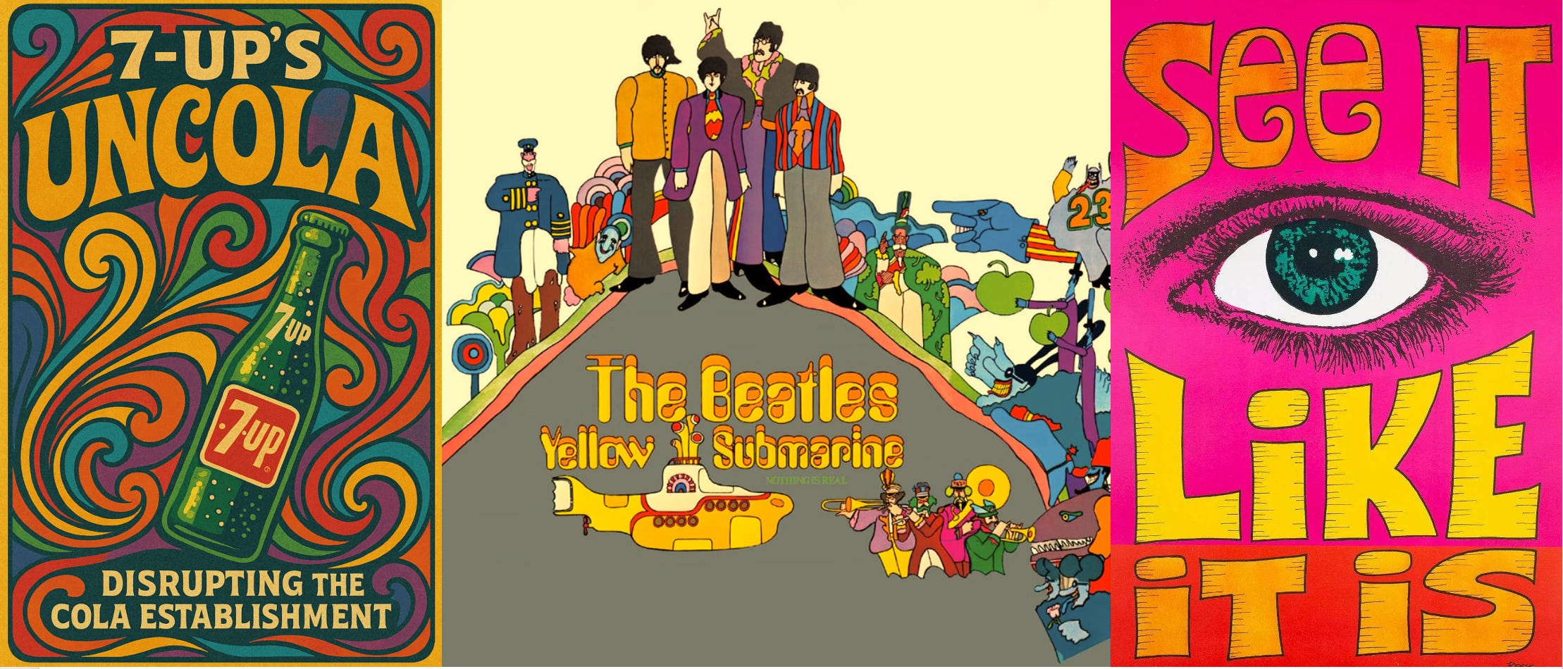
You may be asking, Does any of this matter? I’m here to tell you that yes, it does. It’s fitting that our secretary of state should concern himself with fonts — after all, wars have been fought over them. The font wars of the 1990s, that is, fought between Microsoft and Adobe and involving other parties like Apple. Apparently, controversies about fonts have been going on for a while — maybe as long as fonts have been around. In the 1920s, designer Rudolf Koch accused American Type Founders of stealing his font Koch Antiqua, also known as Locarno. And in 1760, John Baskerville got a lot of grief from readers who claimed his font gave them headaches because it was too high-contrast. I wouldn’t be surprised if ancient monks argued over fonts — or in their case, script styles.
But back to the 1990s. At the time, I worked in book publishing, which means some of my co-workers were book designers and typesetters, people who cared deeply about fonts. I once saw a foreign film with a book designer friend whose main critique of the flick was that the font used in the subtitles looked too 1970s.
It must have rubbed off on me. When I later worked at Adobe, which had by then recovered from the font wars, I had heated arguments with bosses who tried to dictate which fonts we could use in our work. I don’t like being told what to do, especially when it doesn’t make sense, so I wasn’t going to be forced to use Times New Roman without a fight.
Fonts should reflect their times. Calibri, in addition to being more accessible, was more modern than Times New Roman when it was released in 2006 or 2007 (sources disagree on the year — sheesh, can’t we even agree on that?). But in early 2024, Microsoft replaced it with Aptos as their default font, in part to improve readability on high-res screens. I admit I’m quite fond of Aptos. And hey, it’s named for a town in my beloved California “whose widely ranging landscape and climate epitomizes the font’s versatility,” according to its designer, Steve Matteson.
Like other fonts, Aptos has its own character, as Elle Cordova shows brilliantly in this short video:
But there’s more to fonts than character; they also have distinct uses with potentially serious implications. Which font appears on road signs is no joke, because some fonts are more readable for drivers. Highway fonts can signal which country you’re in; even within the U.S. they vary a bit, and which font is best for these signs is not without controversy. Because, fonts.
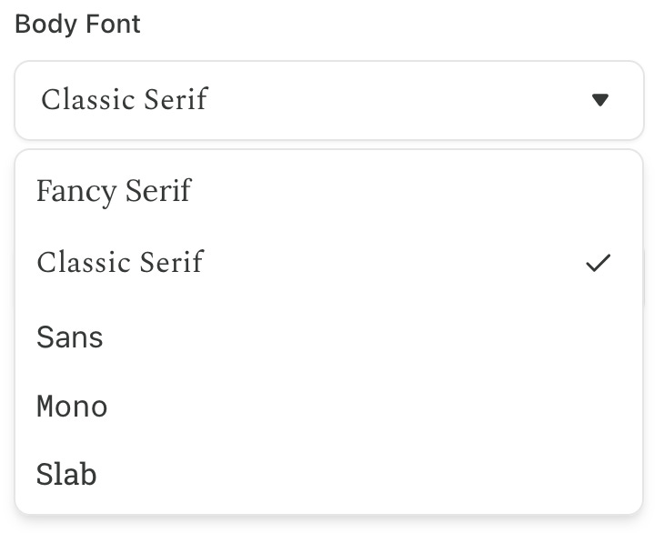
As you can see, fonts are a big part of all our lives. You’re interacting with fonts by reading this post: if you’re reading the email, you’re seeing a sans serif font, and if you’re reading in a browser, the font is “Classic Serif.” Which is a description, not the name of a specific font. Why a serif font? Only Substack can answer that; it makes no sense to me, especially as sans serif fonts are supposedly easier to read on screens — though, like everything related to fonts, that’s controversial. I’d change the font for Flower Child, but Substack provides only a few weird fonts I don’t like. Where’s Calibri? Where’s Aptos? Even Arial? All I know is, they’re not here.
At least I’m not reduced to using Comic Sans, which has the distinction of being one of the most hated fonts of all time. Naturally, though, even that is controversial; when it comes to fonts, it’s hard to find agreement. But if you’ve read this far, I hope you’ll agree with me that fonts are in fact important — too important to be managed by the clowns running our government. Even Comic Sans wouldn’t want to be seen with them.

Not interested in fonts? I also write about semicolons, em dashes, and slang terms. Okay, and lots of other stuff. My most popular posts of 2025, in order of popularity:


Do you know which font I used in the image caption at the top? Do you have thoughts on fonts? Let me know!
I’m old enough to remember a time when you didn’t have screen fonts. This was back in the DOS days, before Windows and before Mac. There was only one font you saw when you were working on the computer, probably courier or some basic IBM machine text You could select a different font or size, but you didn’t see it on the screen, only if you printed the document. The font actually came from the printer, and they were built into the printer itself. If you wanted additional fonts, you’d have to buy a special cartridge, which came with some fonts on it and you plugged that into the printer. Later, they came up with WYSIWIG, which stood for what you see is what you get. Meaning fonts and styles and sizes would actually appear on your screen and correspond to what you printed. That was a real revolution. Thanks for the thoughts on the importance of fonts!
My comment continued: I panicked and told my friend that I couldn’t watch the film because the subtitles were in Souvenir. She gave me a look of repressive rage to let me know that no hysteria about offensive typefaces would be tolerated, so I got a grip and settled down. Retirement from publishing has done wonders for this type hypersensitivity, and I can’t even remember many the names of faces I used to love and hate. I don’t know if that’s good or not, but it is freeing.